𝙚𝙡𝙡𝙞𝙚. (![[personal profile]](https://www.dreamwidth.org/img/silk/identity/user.png) splatstick) wrote in
splatstick) wrote in ![[community profile]](https://www.dreamwidth.org/img/silk/identity/community.png) sousaphone2023-04-30 10:23 pm
sousaphone2023-04-30 10:23 pm
045. the grainy, the bright, and the noisy.

the f$#king background.  🐬 it's too bright. it's too grainy. all it's serving is inspectah deck level of noise. you just want to tear your hair out. how do you fix it? well, you could start over and crop closer to the face so the background is minimum this time. or you can fiddle with the curves, brightness/contrast, and levels, but then you risk ruining how the subject looks. what else can you do? well, try this. the method reduces the brightness and graininess to the point where it's not noticeable. it's quick and easy. if you can use the paintbrush, you can master this in minutes. so let's go! here's an icon with only the psd.  1. create a new layer. you're gonna wanna put it before your adjustments. this is where i do all my coloring because it blends in better.  2. put the layer to soft light.  3. get your paintbrush; select black. it doesn't matter if the background is a light color like white or yellow. we're darkening it so it'll always be black. 4. paint the background. you don't have to be super precise. in fact, you may want to hit a bit of the subject's hair, face, or clothing so the subject blends in better with the background (but do that at the end after you see how it looks against the darkened background; it may not be necessary). however, you will definitely want to avoid hitting any hair or clothing that's a light color because it will darken.  on this one, i did hit her hair. 5. adjust the opacity and fill levels. my default is 50%/70% but it can vary on the lighting, coloring, and medium. sometimes it can be 70%/70% or 30%/50%. just adjust until it looks good!  6. done!  the goal is to have the edited areas look subtle and natural like it was like that from the beginning. others shouldn't be able to clock what was colored; only you.  👍 let's try another, but flip-flopped where the background is light and the subject is washed out.  just the psd.  put the layer to divide instead of soft light so you can see what you're coloring and get all the nooks and crannies.  end result w/ layer to soft light @ 50/70.  see. easy peasy lemon squeezy. it adds a couple of minutes per icon but saves you a headache.  you can use it on faces as well but be careful! a couple of grainy pixels of the subject's cheekbone or the twinkle in their eye glowing in the shadow? sure. color it. but i wouldn't go so far as to try to create a shadow by coloring the side of the face because it can look cartoony and like two face. rely on gradient maps if you want shadows. less is always more.  no gradient map + soft light layer @ 50/70  gradient map + soft light layer @ 50/70 but you can color faces fairly easily on non-live-action mediums (like anime or video games) because faces don't have as much coloring or texture to worry about. in general, i'd say this method is easiest to do on non-live action mediums.  this is also VERY useful if the subject's dark hair or dark clothing is bright and noisy. tbh anything that's too bright, like eyes.  tip — if you're coloring in the subject's baby hair, sideburns, eyebrows, or facial hair, do it on a separate layer and put opacity and fill at lower levels than the layer with the darker, fuller hair. else ya boy or girl is gonna look like groucho marx.  "go, and never darken my brows again!" like i said above, this darkens light colors, which makes it useful if you want your subject's light-colored hair a darker shade.  2 soft light layers: 1st layer @ 80/100, 2nd @ 50/70 buuuut that's getting into coloring which is a whole nother can of worms and the worms are spring snakes and the can reads "beer nuts." 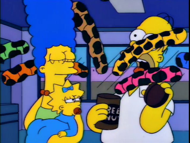 me falling for that classic blunder yet again. questions, comments, concerns? drop them below. and thanks y'all. |
- 1899 — thetvshows
- the alienist — period drama
- amsterdam, arcane, captain america: civil war,
house of the dragon, the last of us, ophelia, sanditon,
see how they run, star trek: strange new worlds,
& star wars: bad bunch — cap-that - arknights — cogitatio (thanks bro)
- fire emblem warriors: three hopes — rpgfan.com
- the queen's gambit — anyataylorjoy.net
- that dirty black bag — mine
- the batman, creed 3, & trigun stampede— fancaps.net
no subject
no subject
btw love your layouts
no subject
no subject
this is a really helpful tutorial, thank you so much for the time you spent suffering on it!!!
no subject
hope you feel better and thank you ❤️
no subject
no subject
thank you 💜💚💜💚
no subject
no subject
i'm glad i was able to help tho. thank you, and take care! ❤️❤️❤️